Vital elements of a user-friendly website

Your website is your shop window and the key platform for promoting your brand. It’s often the first thing a potential customer will see; therefore, it needs to leave a lasting impression as well as highlighting the skills and services you offer. So you need to make a user-friendly website.
Obviously, it must reflect your brand and be aesthetically pleasing, but if it doesn’t convey your key messages or if it’s difficult to use, then whether it looks the part or not it won’t be effective.
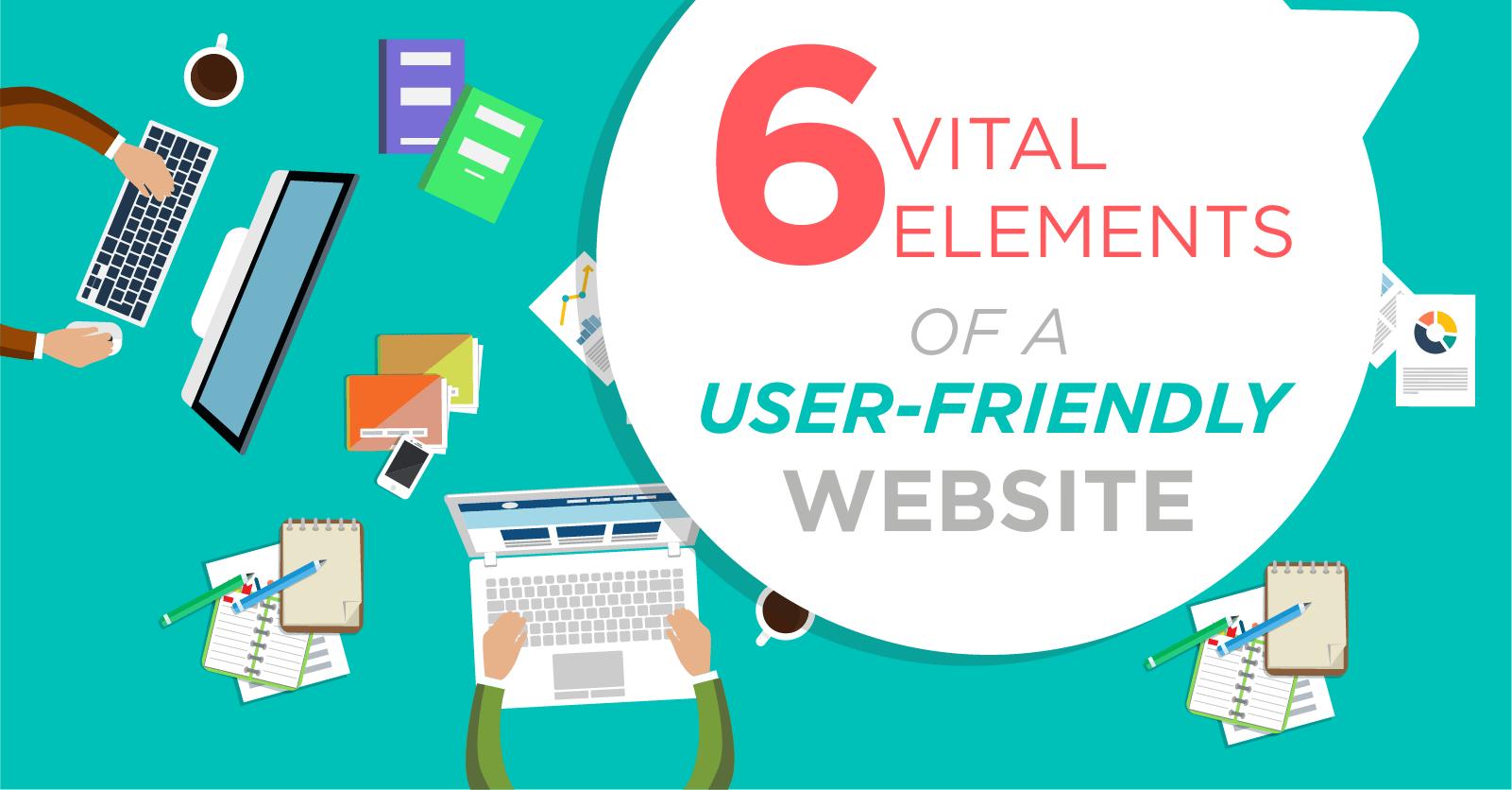
We have compiled 6 tips to refer to when designing websites:
- Clear navigation – If your customer can’t navigate around your website then you have fallen at the first hurdle. The menu must be easy to understand and help the user quickly get to where they want to go. When naming the pages remember this will have to reflect in the navigation so don’t make it over complicated, keep it simple and to the point.
- Responsive design – Websites aren’t just accessed through desktop computers anymore, meaning your website shouldn’t just be designed for one platform. The design must be responsive adapting to different screen types, this ensures that the user has a smooth experience on all devices. More people access the internet on their hand-held devices than ever before, so if your website isn’t compatible then you’re losing out on potential customers.
- Keep it simple! – Whether that’s the navigation, the design or content, there is no need to over complicate it. If the user cannot understand the site, they aren’t going to interact with it. When in doubt, keep it simple.
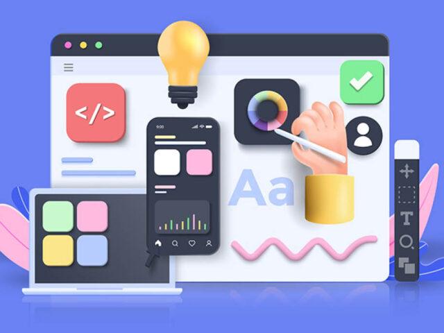
- Consistency – Making sure the whole site is consistent is key. Ensure a clear, consistent and organised structure by defining fixed styles for headers, buttons, menus etc so they are instantly recognisable and do exactly what the user expects them to do. Make sure there is a good balance between text and images – people won’t read a page that is too text heavy, break up text with images and call to actions and make sure you use the right keywords for your target audience.
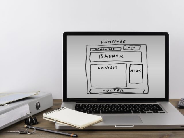
- Take a step back – Take a look at the website from the user’s eyes. The overall layout of the site should be well planned before the site is designed or built. To create an aesthetically pleasing website that is easy to navigate, you need to ensure the content hierarchy is well thought out. Draw the eye of the user to where you want them to look first by using catchy visuals and large font sizes. Less important information can appear smaller or further down the page.
- Why – Think about why you are investing in a website, what do you want people to use it for? This is one of the first questions we ask a client.
If the websites main function is to inform, educate and engage with customers then a really good blog might be more effective than lots of information pages. Whereas if you want to try SEO or PPC marketing, ensuring the site is ready for optimisation is an important part of the build and testing phase. Whatever the purpose Analytics should be set up then you can track the usage of your site and use this data to make improvements.
If you are looking to update your website and want to ensure it achieves its full potential, get in touch with Definition today on 0161 696 3459.
We will work with you to create a website that is bespoke to your requirements with your target audience in mind. See our work here.


